How to Hang 3 Pictures on a Wall Layout Like a Pro (Even If You’re Not Artistic)
Alright, confession time.
I used to be that person—the one who’d excitedly buy three gorgeous prints, come home, stare at the blank wall for twenty minutes, and then… shove them under the bed for “later.” Why? Because hanging three pictures on a wall sounds easy until you’re standing there, hammer in hand, spiraling into a decision-making black hole.
Straight line or triangle? Equal spacing or intentional asymmetry? Should I center them to the wall or the furniture? Should I just move and start over?
Deep breaths.
If you’ve ever found yourself spiraling like that, you’re not alone—and you’ve come to the right place. In this post, I’m going to walk you through how to hang 3 pictures on your wall like a total layout legend (even if your eye for design is more potato than Picasso).
No confusing jargon, no “just eyeball it” nonsense. Just a solid guide with some tricks, laughs, and maybe a few lightbulb moments. Sound good? Let’s get those walls from meh to magnifique.
Let’s Talk Layouts—Which 3-Picture Style is Your Vibe?
Before we even pick up a single nail, let’s figure out what kind of layout is calling your name. Because let’s be honest—hanging pictures is 30% measuring, 70% staring at the wall trying to imagine if it “feels right.”
I’ve tried all the classic arrangements, and they each give off a totally different vibe. The trick is choosing one that works for your space and your personality. Yes, your wall can have a personality. Let’s dive into the top three.
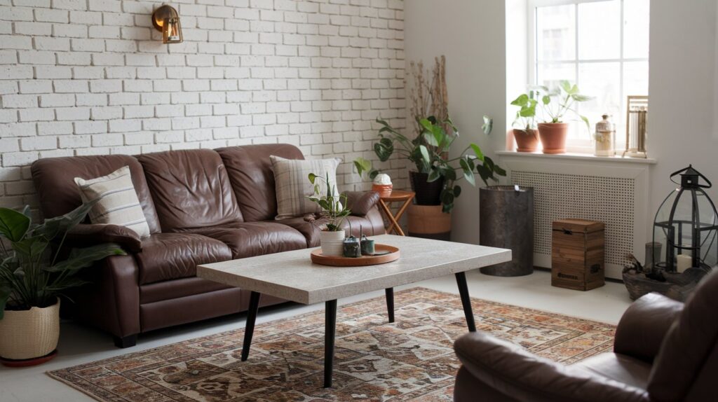
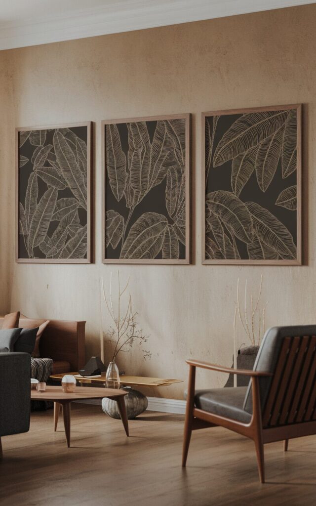
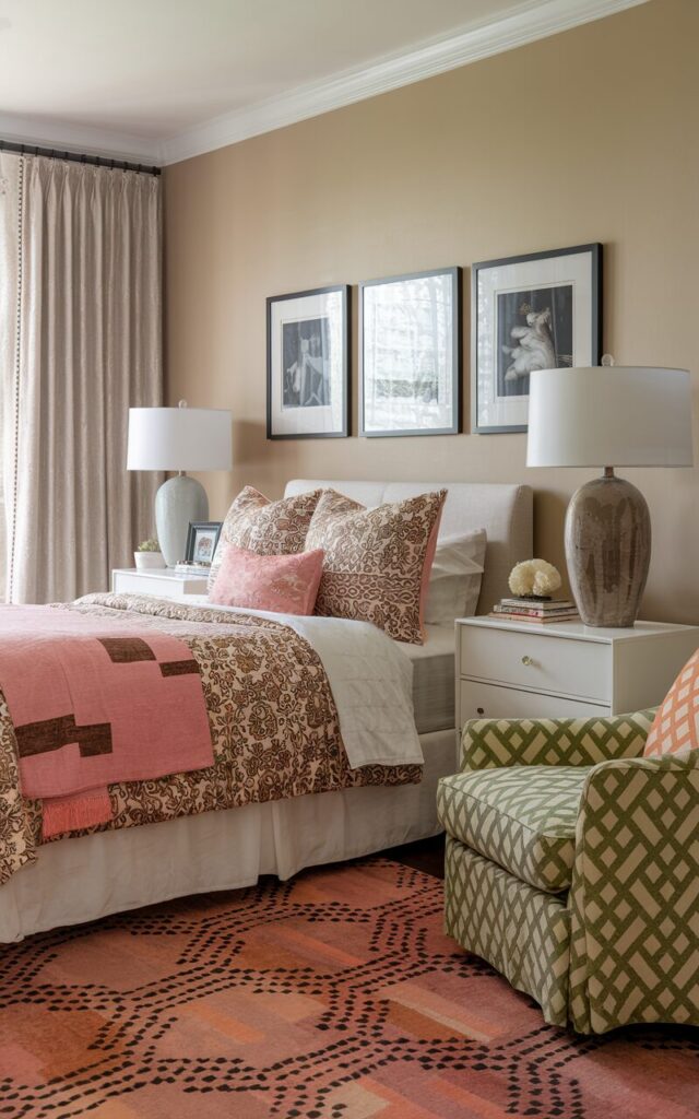
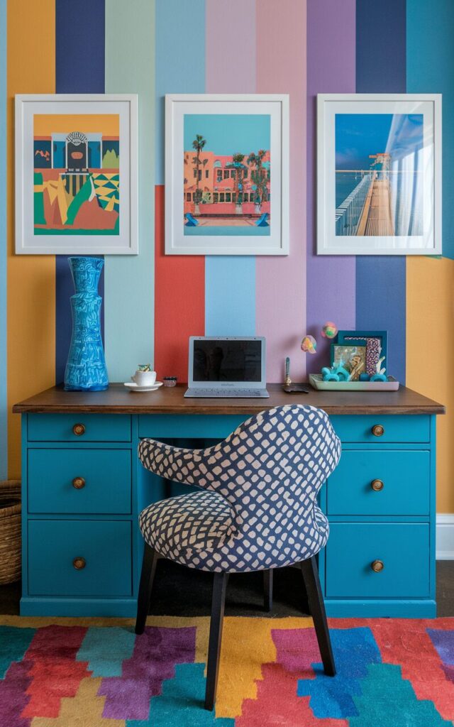
The Classic Trio
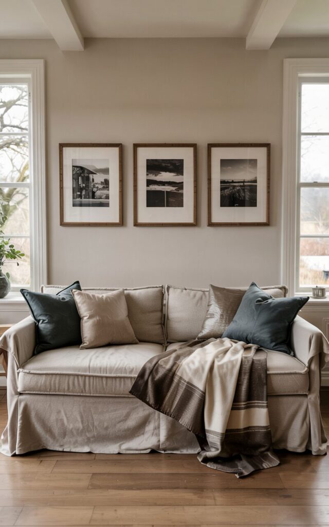
This one’s a crowd-pleaser. Think three pictures hung in a straight line—either side by side (horizontal) or stacked top to bottom (vertical).
It’s neat. It’s symmetrical. It screams, “I have my life together,” even if your laundry pile says otherwise.
Perfect for above a couch, bed, or hallway. Keep the spacing even—2 to 3 inches between frames is the design sweet spot. Too close and it feels cramped. Too far and suddenly your wall looks like it’s socially distancing.
Vibe: Minimalist. Modern. Low-stress.
Bonus points: Works great with matching frames or themed artwork (think: three beach shots or a trio of botanicals).
The Stacked Sandwich
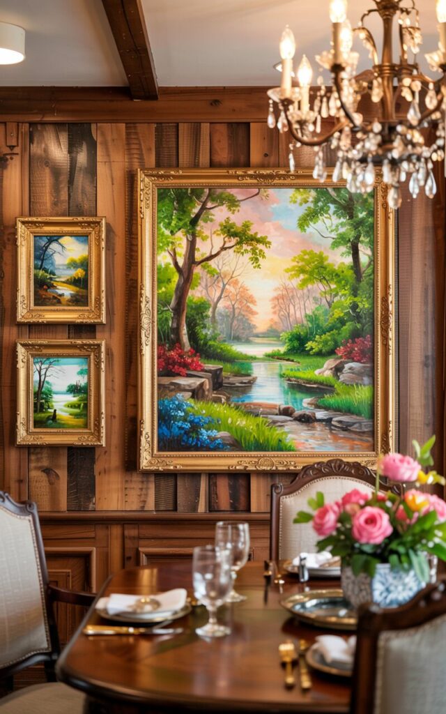
Okay, I made that name up, but hear me out. This is when you have one picture in the center and the other two flanking it—either above and below or slightly off to the side.
It’s perfect for tighter spaces or those weird wall nooks that just sit there mocking you.
The stacked sandwich works surprisingly well in entryways, bathrooms, and even stairways. It feels intentional without being too try-hard.
Vibe: Cozy. Structured but a bit unexpected.
Pro tip: Try mixing frame sizes here. One large center frame with two smaller accents? Chef’s kiss.
The Gallery Cluster
This one’s for the rebels. The creative souls. The “I don’t follow the rules, I reinterpret them” types.
Instead of lining everything up, you create a small grouping with a more organic feel. Think of it as a micro-gallery wall, but less intimidating.
It works great in spaces where you want visual interest without turning your wall into a full-blown museum.
Vibe: Artsy. Eclectic. A little fancy but still fun.
Caution: Just because it’s “freeform” doesn’t mean you should totally wing it. There’s still a method to the madness (we’ll get to that soon).
📋 Quick-Glance Layout Comparison Table:
| Layout Style | Best For | Vibe | Difficulty Level |
|---|---|---|---|
| Classic Trio | Wide or tall walls | Clean & Modern | Easy |
| Stacked Sandwich | Hallways, above furniture | Compact & Stylish | Moderate |
| Gallery Cluster | Feature walls, staircases | Creative & Dynamic | Medium-Hard |
Gather Your Tools—No Laser Eyes Required
Before we go all Bob the Builder on your wall, let’s round up the essentials. And no, “good vibes” and “manifestation” won’t hang these frames for you—though we do support that energy.
Here’s what you’ll actually need:
🧰 The Picture-Hanging Toolkit:
- Measuring Tape – You will need to measure. I know. Ugh. But we’ll survive.
- Painter’s Tape – Your new best friend for planning without commitment.
- Pencil – For marking your wall lightly, not for writing sad poetry mid-project.
- Level – To make sure your frames don’t look like they’re sliding into the weekend.
- Picture Hanging Hardware – Hooks, nails, command strips—your choice.
- Hammer – Only if you’re using nails. Not to be confused with a stress relief tool.
Bonus: A glass of water (or wine), some good tunes, and a “look at me being productive” mindset. You’ve got this.
Step-by-Step—Let’s Get These Beauties on the Wall
We’re officially entering do-the-thing territory. Don’t worry, I’ll walk you through it like a calm GPS voice—minus the passive-aggressive “recalculating.”
Step 1: Plan the Layout on the Floor
First things first—don’t just start hammering. That’s how regrets happen.
Lay your three pictures out on the floor, preferably in front of the wall you’re planning to hang them on. Shuffle them around. Test different arrangements. See what looks good. Feel the feng shui, if you will.
Once you like the order and spacing, take a photo with your phone. Trust me, your brain will forget everything the second you stand up. Snap that pic. Call it “artistic blueprint” if that makes you feel cooler.
Step 2: Measure Twice, Mark Once
This is where we pretend we’re mathematicians but like, the chill kind.
- Grab that measuring tape and figure out the total width or height your layout will take up, including spacing (usually 2–3 inches between frames is the sweet spot).
- Lightly mark the top center point for each picture with a pencil.
- Still breathing? Great.
Optional: Whisper encouraging things to yourself while measuring. “Wow, look at me, measuring things like a responsible adult.”
Step 3: Use Tape to Visualize on the Wall
Now for the painter’s tape hack, aka the game-changer.
- Use tape to outline the exact area your layout will take up—frame by frame.
- This gives you a chance to step back, squint a little, and make sure it looks balanced.
- Not quite right? Adjust the tape instead of redoing nail holes. You’re welcome.
Pro tip: This also helps if you have commitment issues with layout decisions. It’s like trying on outfits before a big date—zero risk, all the potential.
Step 4: Hang with Confidence (And Maybe a Level)
Time to commit! Gently, confidently, and with fewer second guesses than a group chat about dinner plans.
- Install your hooks, nails, or strips at the marked center points.
- Use a level (or level app if you’re living that tech life) to make sure everything’s not wonky.
- Hang those beauties.
Look at you. A picture-hanging powerhouse.
Step 5: Adjust and Admire
Step back. Admire. Do a little happy dance.
If something feels a little “off,” it’s okay to tweak. Pictures aren’t tattoos—you can move them.
And here’s a fun secret: if it looks good to YOU, it is good. Design rules are helpful, but your space should reflect your style, not some textbook layout.
Bonus Tips that make you think “Why Didn’t I Think of That?”
You made it to the expert tips zone—where the small stuff makes a big difference. Let’s sprinkle in some genius:
- 🗂️ Use Paper Templates – Cut out paper in the size of your frames, tape ‘em to the wall to test layouts before committing. It’s like dress rehearsal for your art.
- 🔄 Mix Frame Sizes – Who says they all have to match? A large centerpiece with two smaller frames can look super dynamic.
- 🎨 Odd Numbers Are Magic – Designers swear by odd-numbered groupings. There’s something naturally pleasing about 3, 5, or 7. Science agrees. Probably.
- 📏 Don’t Always Center to the Wall – Sometimes centering to the furniture or the eye line works better. Your wall isn’t the boss of you.
- 🪄 Command Strips = Damage-Free Wizardry – If you rent or fear commitment (relatable), these babies are your best bet.
You got it! Let’s bring this home with some real-life inspo and a fun, feel-good conclusion that makes your readers want to pick up a hammer (or command strip) immediately. Here we go:
Real-Life Inspo—Layouts That Actually Work
Still staring at your three frames like they’re pieces in an art puzzle? Let’s take the guesswork out and serve up some inspiration—no gallery membership required.
Here are a few layout ideas and style combos that look 🔥 in real life and not just in Pinterest dreams:
🖤 The Black & White Gallery Row
Layout Style: Classic Trio
Where It Works: Over a bed, sofa, or dining bench
Why It Slaps: High-contrast black frames with white matting and monochrome photos? Instant elegance. It gives “I read design magazines” without the pretension.
Pro tip: Choose portraits or architectural shots for a timeless look.
🌍 The Colorful Travel Shots Cluster
Layout Style: Gallery Cluster
Where It Works: Hallways, home offices, or entryways
Why It Slaps: A fun mix of colorful prints from your adventures adds energy and personality. It’s like a scrapbook, but fancy.
Mix frame finishes (wood, black, gold) to keep it playful. Bonus: people will definitely ask you where that waterfall photo was taken.
🌿 The Botanical Trio
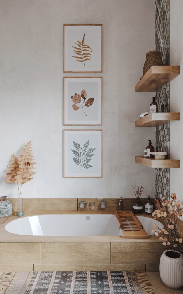
Layout Style: Vertical Stack
Where It Works: Bathroom wall, narrow hallway, side of a bookshelf
Why It Slaps: Three calming prints of leaves, ferns, or florals give spa vibes instantly.
Greenery never goes out of style. And no watering required.
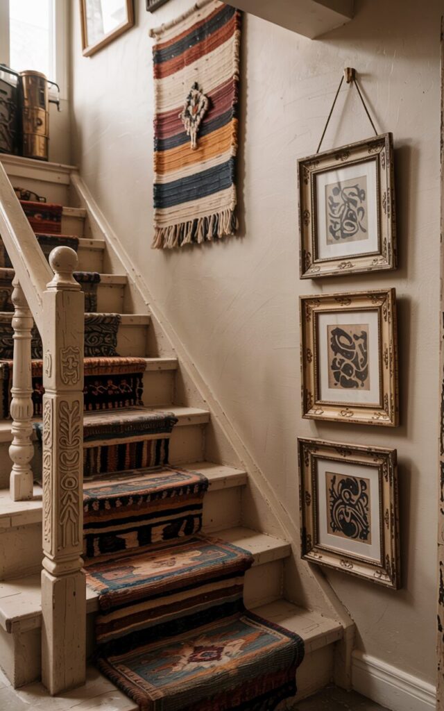
👶 The Baby, The Pet, The Chaos Shot
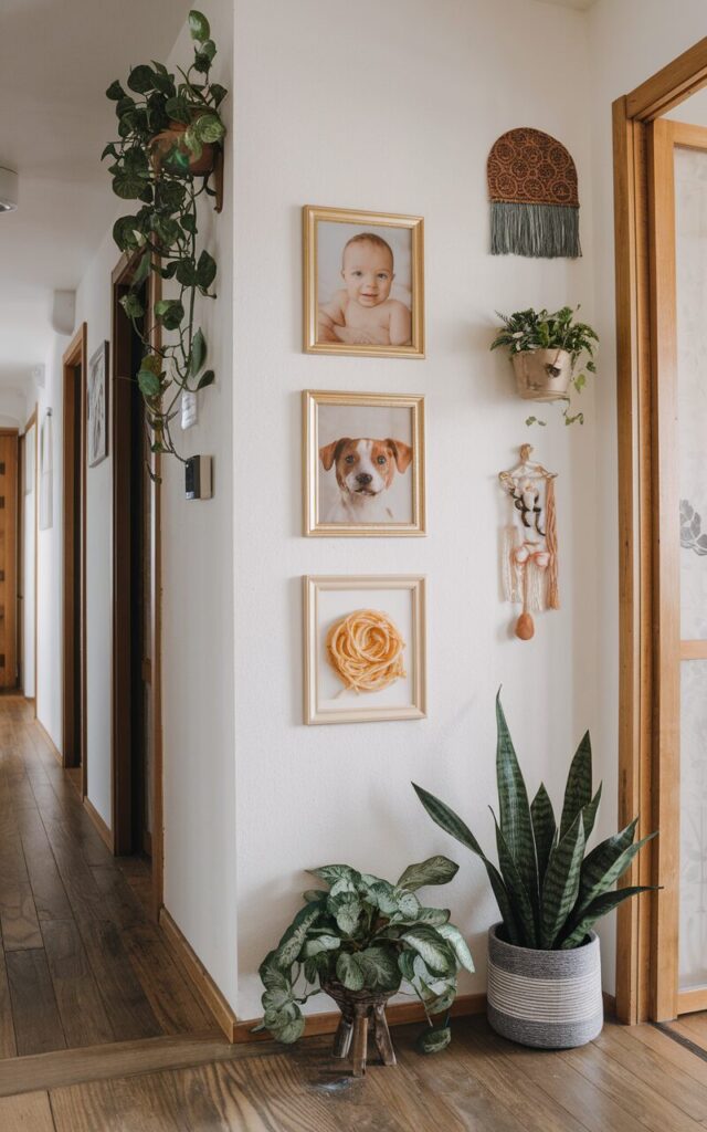
Layout Style: Horizontal Trio
Where It Works: Anywhere you want people to stop and smile
Why It Slaps: One frame with a sweet baby photo, one with your pet, and one with something ridiculous (think: a spaghetti-smeared face or a dog in sunglasses). Balance and humor, all in one layout. Iconic.
You Did It! Your Wall No Longer Looks Like a Blank Page
Let’s just take a moment to celebrate the fact that you didn’t settle for leaning those pictures against the wall for “a few weeks.” You planned, measured, taped, adjusted, and now—your wall is alive, my friend.
To recap the process:
- You chose a layout that vibes with your space (and your soul).
- You gathered your tools like a DIY ninja.
- You laid it out, marked it up, and got those frames on the wall, not just in your head.
- You even squinted, adjusted, and made it just right.
Now step back, grab your phone, and snap that victory selfie in front of your freshly decorated wall. Post it. Brag about it. Send it to your mom.
Because this isn’t just wall art—it’s you on a wall. And you crushed it. 👏